The fact that my design is off a pun in my eyes it ticks all the imaginative and inspirational boxes. Though my controversial opinions might not make sense from ‘what makes a good design’ perspective. Nonetheless this design aspect (growing an idea out of wordplay) that inspire other people to think about coming up with ideas with their own products. My product’s theme (my coat) is the most imaginative aspect that makes it standout compared to other business cards.
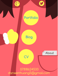
Great ideas wouldn’t mean a lot if the execution of the final design wasn’t up to scratch. With that in mind I made sure to follow as many concepts of design as possible. The elements are asymmetrically balanced: whether it’s placing the arm on the left and the pocket on the right making sure that the icons are aligned correctly, I made sure to achieve a balanced design. For the colour scheme I went for yellow, red and blue (triad colours). I gone for a pastel and soft colour palette to give a cheery impression of my work, for that reason I choose to use vector graphics (known for their tranquil and flat colours) whilst sticking to colour theories. I repeated the same design for the buttons as a way to group them in one category (links) and made sure they were large enough to be easily accessible.
My final design was much reflective of my original plan though personally I would come with more ideas first time round (so that if this one didn’t turn out so well I’d have back up). Next time it would be better if I submitted several ideas as I was lucky enough that this idea worked out in the end.
How does it stand up to other pro designer’s works (namely their business cards)? Well it certainly wouldn’t look out-of-place in a pile or designer’s business cards though there’s still much to work on in my eyes. As it is an interactive card there’s a lack of dynamic interactions which will hopefully be resolved once I run this app though Adobe Edge. In terms of design my work lacks the simplicity of graduates but it stands up look wise (though I’m sure some elements are off-aligned by a few millimeters). To truly be able to boast about it I would need to add in little details such as animations whilst making sure that my design remains uncluttered (a pitfall that I know too well).
All in all I’m pleased about my app as it’s appealing and refreshing to look at whilst representing my persona at the same time. I think that’s the most important part about a business card, it has to say something about yourself with visuals, not words. Well moving on to animating the thing…